File 01 Banking · Web + Mobile · Deloitte
Rebuilding everyday banking around a single app
A major Indian bank's digital experience had fragmented into separate portals - one for payments, one for loans, one for investments. Customers noticed. This is how a 20-designer team consolidated it into one multi-modal app, and the part of it I owned.
- Role
- UI/UX Designer - Savings Accounts & Deposits module
- Team
- 20 designers in UI+UX pods, with business analysts
- Platform
- Web + mobile banking
- Employer
- Deloitte, 2023–2026
At a glance
- What it is
- A full web + mobile revamp for a major Indian bank, consolidating separate payment, loan, and investment portals into one app.
- The problem
- 10,000+ customer complaints against the existing experience - 52% caused by login and registration alone.
- My role
- Owned the Savings Accounts & Deposits module end to end, within a 20-designer pod structure at Deloitte.
- What I did
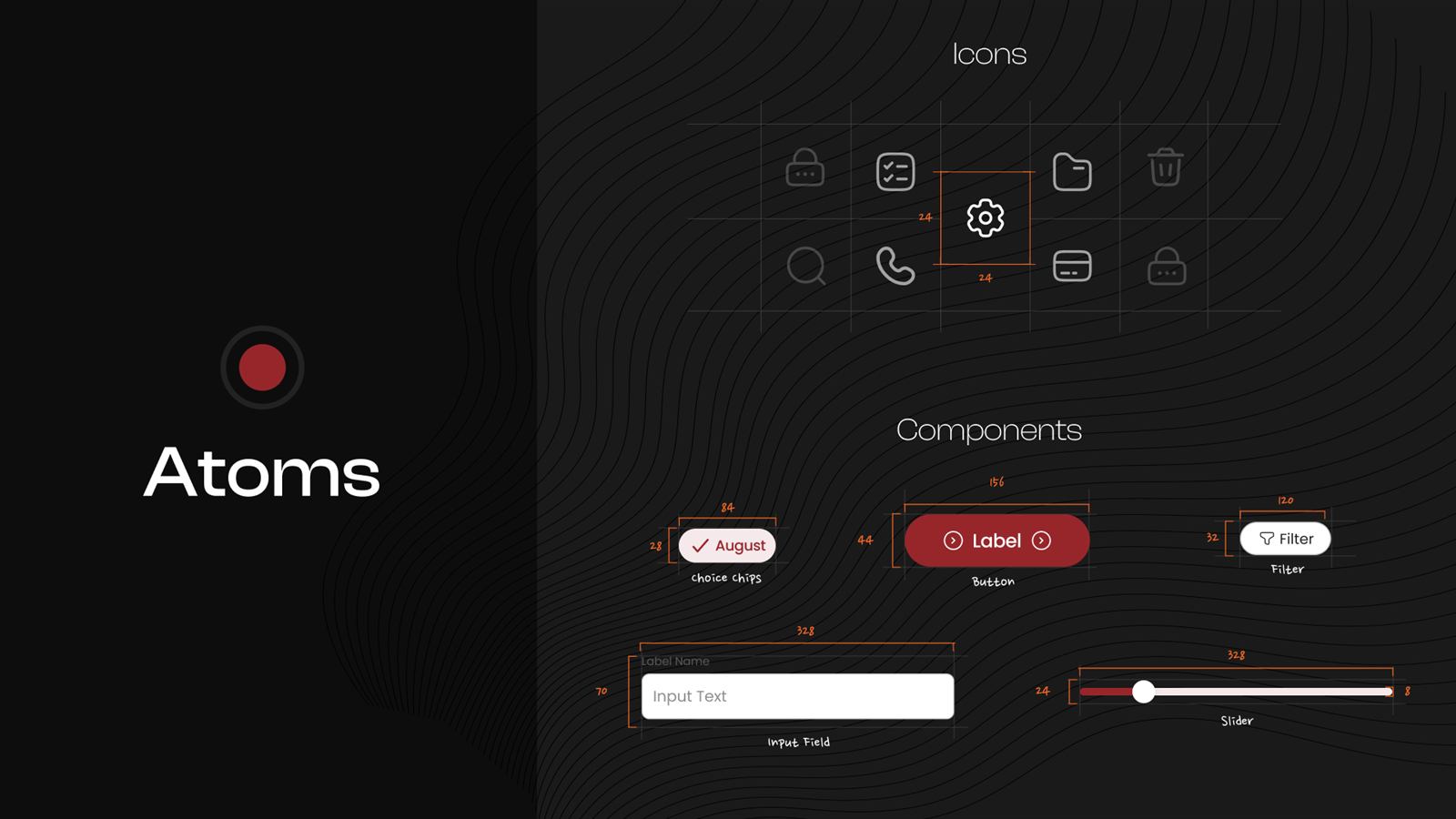
- Module IA and flows on a shared atomic design system; split deposits opening from deposits management so both stay simple as products grow.
- Research base
- 50+ customer interviews and 50+ branch visits - decisions traced to observed behavior, not assumptions.
- The impact
- One unified app; the single largest complaint source directly addressed; an IA that absorbs new products without re-fragmenting.
The problem arrived as a number
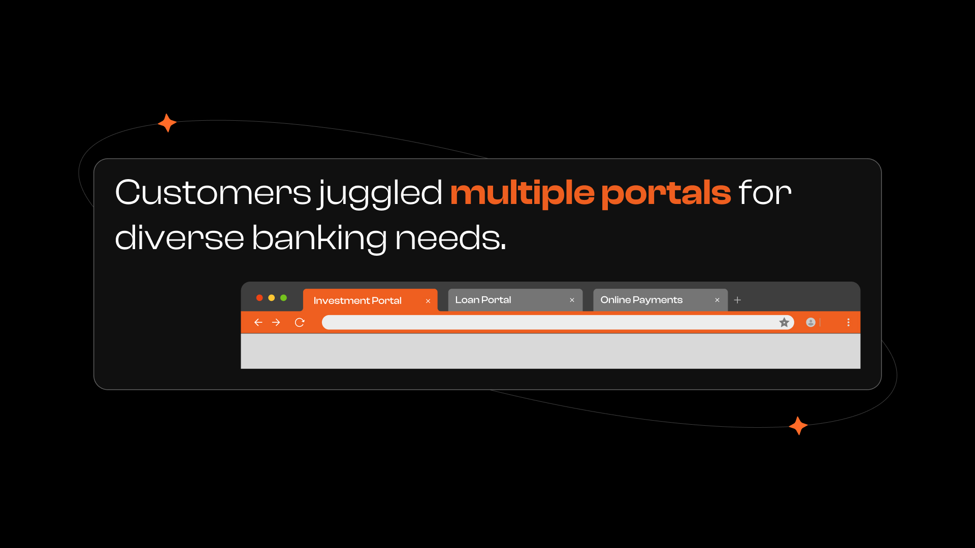
Customers had to juggle multiple portals to finish basic banking tasks - and the complaints made the cost measurable. Slow load times, a punishing login flow, and features scattered across disconnected systems added up to an experience people actively avoided.
Research that left the building
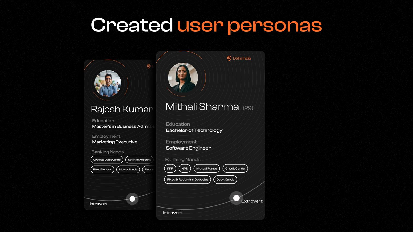
Before locking scope, the team went to where banking actually happens. We aligned the bank's business goals with what customers said and did - not what the requirements document assumed.
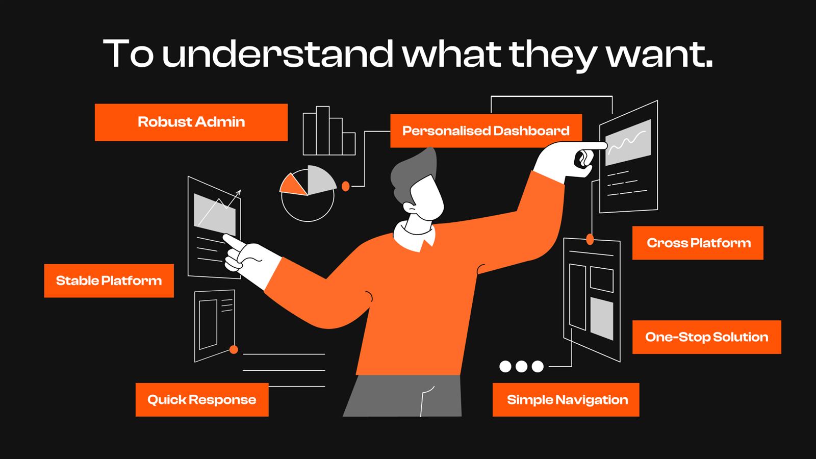
The synthesis was blunt: customers wanted a stable platform, quick response, simple navigation, a personalised dashboard - and above all, one place for everything.
An architecture built to not re-fragment
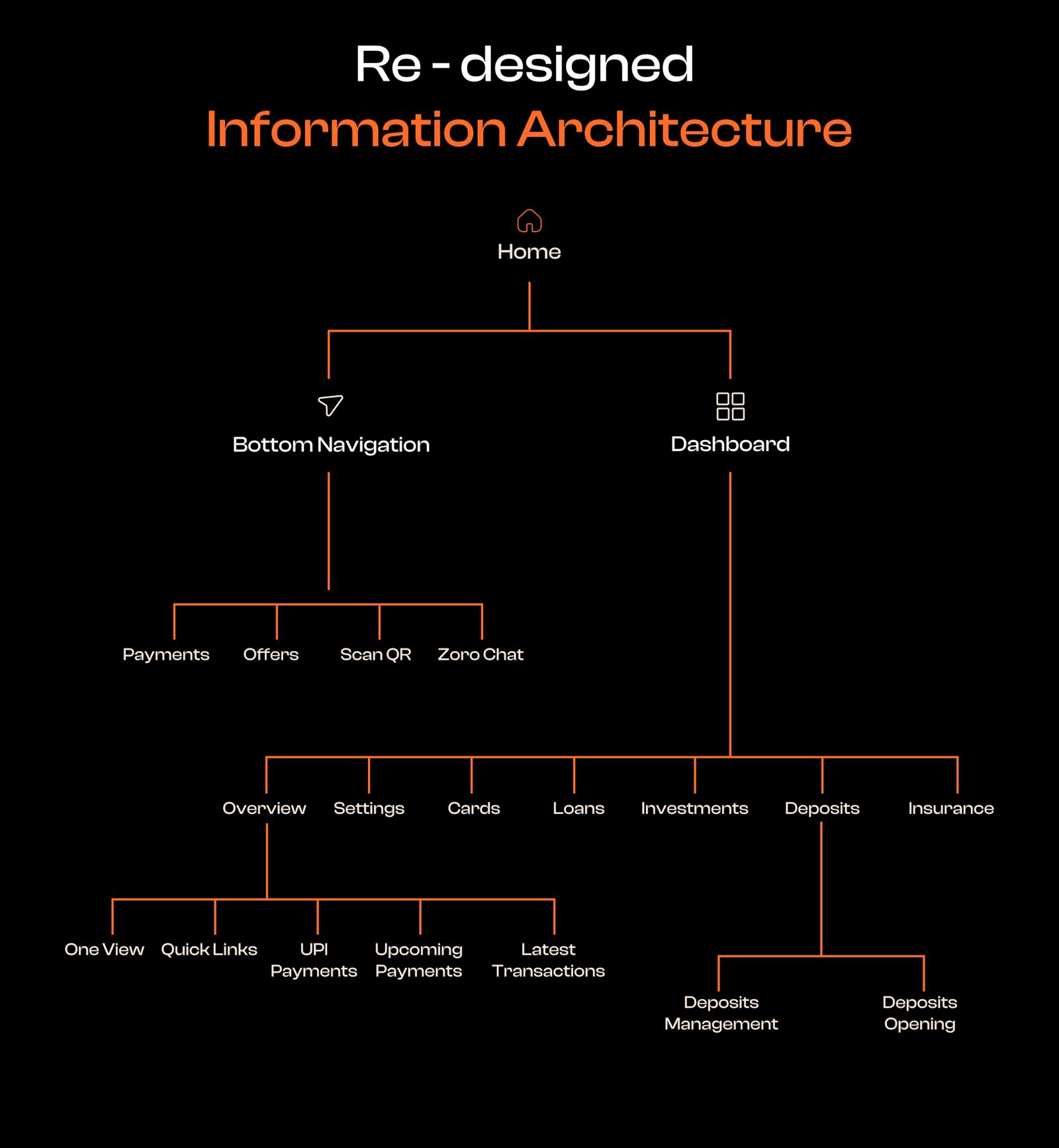
The redesigned information architecture split the app along how often things are used, not how the bank is organized internally: a bottom navigation for daily actions (payments, offers, scan-and-pay, chat) and a dashboard for account management - cards, loans, investments, deposits, insurance.
Within my module, I separated deposits management from deposits opening, so servicing an existing customer never competes for space with acquiring a new one - a small structural decision that keeps both flows simple as products multiply.
The flows I owned
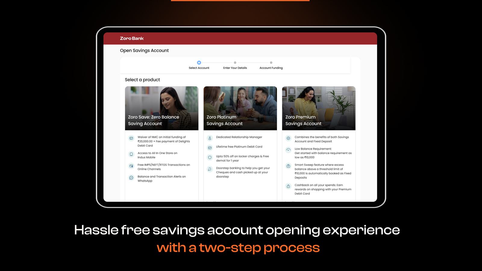
A savings account is the front door of the bank - the first product most customers ever open - and deposits are where they place their long-term trust. The redesigned account-opening flow reduced the journey to a guided two-step process - select a product, fund it - with every product's terms laid out for comparison before commitment, not after.
Outcome
- A fragmented, multi-portal experience consolidated into one unified app across web and mobile.
- The single largest complaint source - login and registration, at 52% - addressed with a redesigned entry flow.
- An IA with room to grow: new products slot into the existing structure instead of spawning new portals.
- A shared atomic design system keeping 20 designers' output consistent across every module.
Client identity anonymized ("Zoro Bank" is a stand-in used in these artifacts). Work shown was done as part of a Deloitte engagement team; I owned the Savings Accounts & Deposits module.